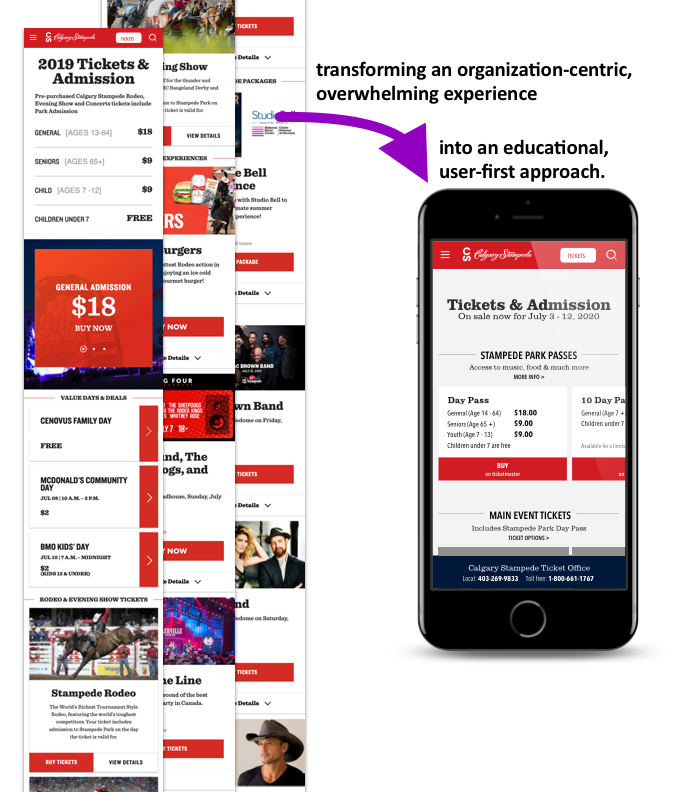
Ticket Experience Refresh
The status quo was an organization centric, confusing experience that did not effectively market or merchandise the festival. Baseline usability testing proved poor comprehension of the festival with out of town visitors. A much loved local festival needed a redesign to better help visitors understand, plan and experience the Stampede.

Objective
Improve the ticket purchase pathway as part of the passive & active planning experience
Improve comprehension of the festival by out of town visitors
By…
Role
Senior UX designer
Platform
Responsive web
Team
Account team, Client partners, Project manager, User research, Visual design, Copy, Engineering
Skills
User advocate, Interaction design, UX design, IA, Prototyping
Responsibilities
Primary designer contributor for overall experience, including tools
Completed a usability and accessibility audit
Worked with the copywriting team to craft the nomenclature
Collaborated with the engineering and creative team to define the interface
Created wireframes and prototypes
Challenge
The current experience assumed visitors already spoke ‘Stampede’.
Revamp the entire ticket system from the labeling to the tiers.
Enable consistency and education throughout the ecosystem.
So, our team gathered impressions from a baseline usability test to identify areas for improvement.
How did we do it?
Research · Design
Research/User research
We engaged the user research team to complete a user test on planning. Both out-of-town visitors and local folks were engaged in moderated interviews with a task completion component. The following concerns were identified:
Out-of-town visitors were confused, with little understanding of location, scope and price
Out of Town participants did not understand if the General Admission cost was per day or if the Rodeo was a separate ticketed event.
Ticket page felt long that it had too many choices for ticket packages, which created confusion.
Both groups struggled to find anything on the site that detailed what music is included in General Admission.
Individuals didn’t understand event names
Individuals did not expect to be re-directed to an external ticket vendor from the Buy Tickets button.
The General Admissions purchase button embedded in an auto-rotating carousel was difficult to interact with.
Research/Component audit & strategy
I completed a comprehensive review of website components in order to identify usability, accessibility & redundancy concerns. This fed into a strategy which the larger team contributed to. It identified which components to keep, remove, combine or modify in order to improve user experience, achieve Web Content Accessibility Guidelines’ (WCAG) Double A compliance, & streamline development. This enabled us to find systemic concerns with current patterns and with each pathway we tacked, be aware of the entire ecosystem.

Ticket event card progression
Include more event details to maintain focus on page and increase conversion.
Designing the interface/Sketches
First I explored a tiered ticket system to help frame the experience for the out-of-town visitors.

Instead of the ambiguous term ‘General Admission’ I used the name of the location, which was the exhibition grounds. Much of the Stampede was held at the grounds but some events were off-site. These were not included in the pass.
The second tier were tickets for Special events or Main concerts. This helped to distinguish between the hundreds of concerts and events included in the pass vs the ones that required an extra cost.
Lastly, packages included the pass, a premiere event and a special experience.
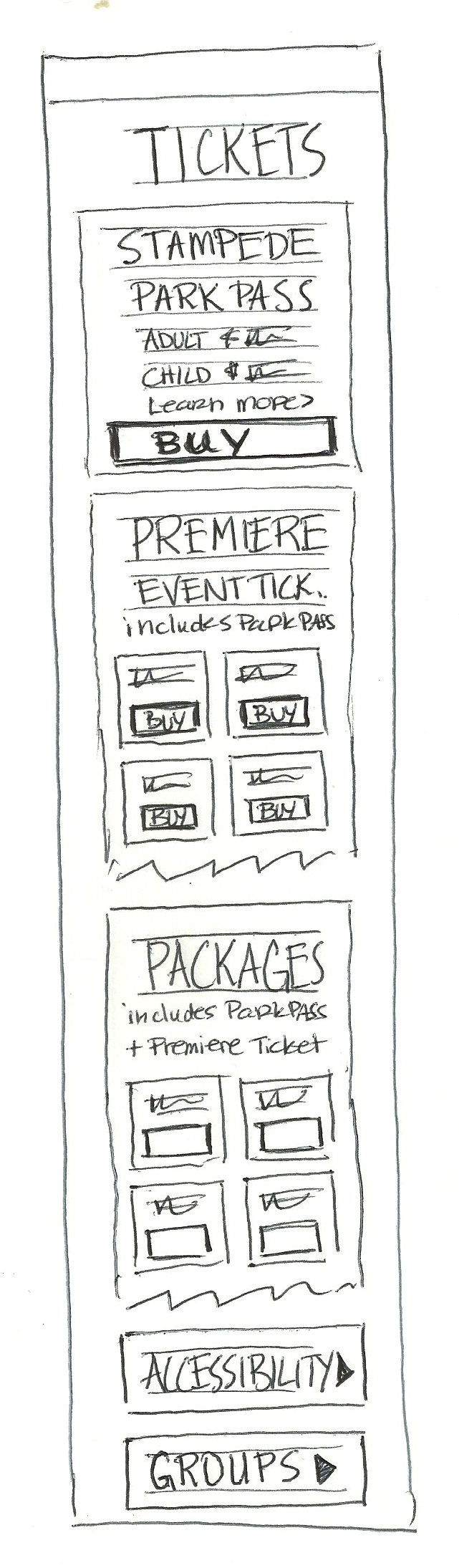
I explored different card patterns. Considerations were:
Variation between cards (Single card for Park Pass vs Title, description and listings for Events & Packages)
Amount of listings per card
A desire to maintain a single page for all ticket types and listings
Scannability and comprehension of ticket types
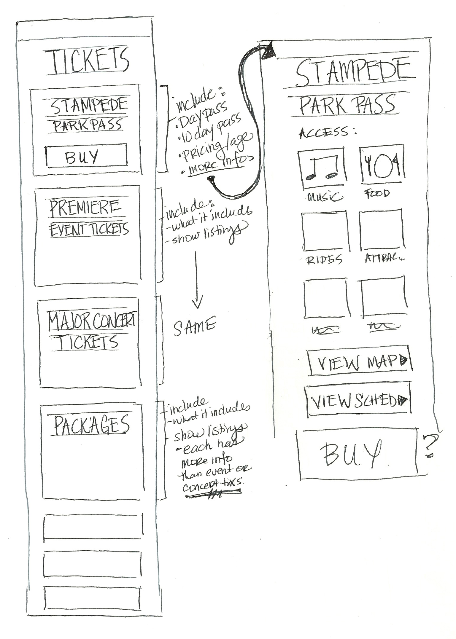
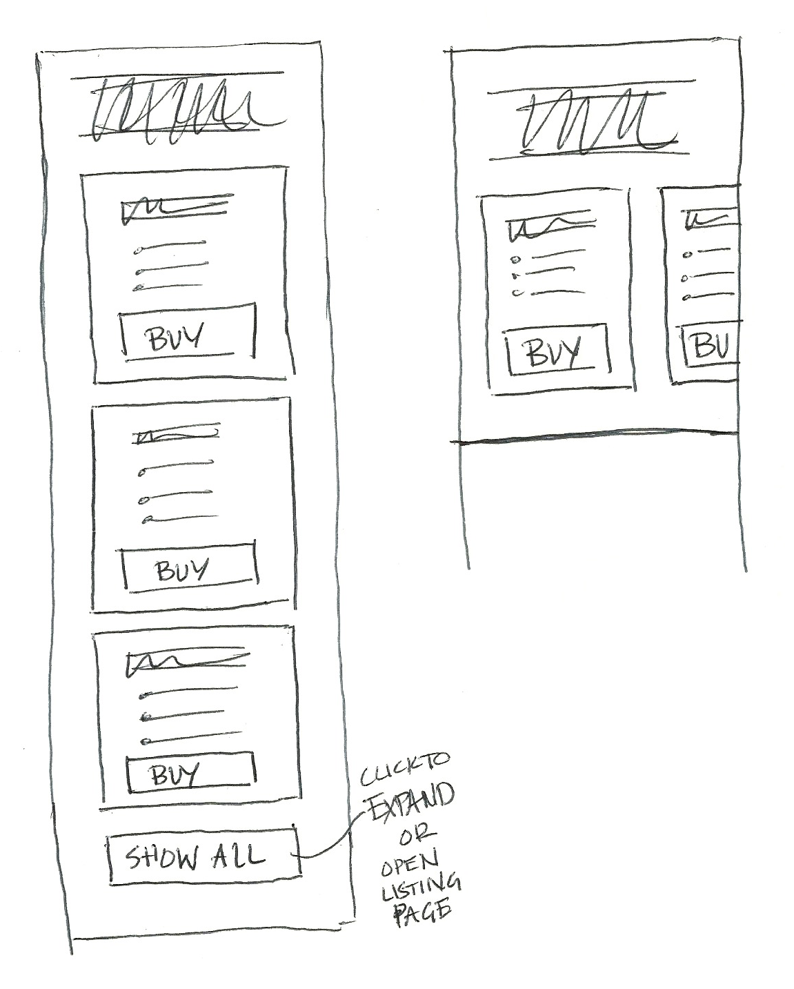
Although the three tiered approach was very simple, I became concerned that the headliner concerts were not highlighted enough. So I pulled them out them out to create another module.
I explored using progressive disclosure to educate out-of-towners on what the park pass included.
Designing the Interface/Wireframes & Prototypes
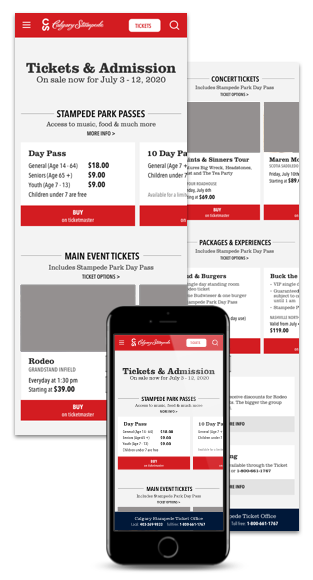
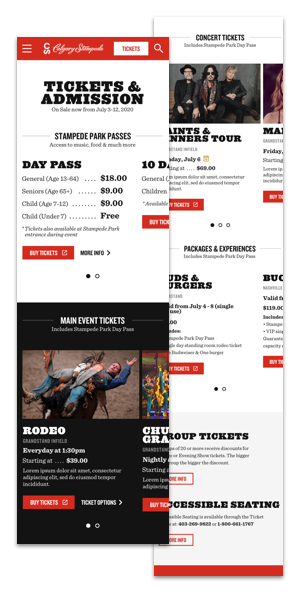
I explored the finer details in the wireframes using the same fonts as the style guide. Collaborating with the copywriter I addressed terminology challenges. In addition, I prototyped the swipe carousel.
As a team we settled on a final approach. When exploring the details of each event card I was conscious of minimizing variation across the wider planning experience while attending to the unique needs of the ticket page.
Our approach made the following improvements:
Introduced ticket tiers
Include description with link to learn more about what the ticket includes
Provide two options - Day & 10 day pass to clarify scope of ticket
Introduced a swipe carousel for a more usable pattern for grouping related tickets, also decreased the page length
Add ‘on Ticketmaster’ to clarify re-direction
Renamed events such as Evening Show to describe the activities
Used established patterns for action buttons
The Result
Once the entire planning experience was reworked, the design team applied the final patterns and styles.
In addition, I integrated the ticket tiers and terminology changes across the planning experience - taking care to maintain our educational approach.