HP eCommerce
HP sought to rework their lagging home and small business e-commerce experiences. As, the lead UX architect, I worked with the team to guide the design process and facilitate decision-making. We validated each decision through rigorous best-practice analysis and user testing with the goal of increasing conversion.
Role | Lead experience architect
Agency | Critical Mass
Ask | Create an e-commerce experience for home office and small business consumer websites
Team | Project management, Planner, Experience architect, Visual design, User research, Engineering, Content

Responsibilities
Presented concepts to, gathered feedback and guided design conversations with US client partners
Collaborated with user research team to define & implement research plans
Scoped and estimated design work
Collaborated with in-house creative and engineering team
Built high-fidelity, interactive prototypes
Defined page templates and detailed interactions
Led & mentored UX architecture team
Managed project delivery
How did we do it?
1. Best Practices 2. User Research 3. Storyboarding & Sequencing 4. Wireframes & Detailed Flows 5. Usability Testing 6. IA & Card Sorting
1. Best Practices Recommendations
In lieu of primary research we conducted a thorough tertiary research and best-practice review. Using this as our baseline, we were able to make strong data-driven recommendations. These defined our experience principles, which would drive our design decisions.
To bring the experience up to date we recommended the following changes;
reducing the checkout process to single page,
adding mini-cart and guest checkout,
re-organizing the categories and
introducing an all-in-one product details page.

2. User Research & Analysis
Using established shopper profiles, we identified primary shopping habits and flows. Since the type and method of information consumption was varied, we created an information-dense product-details page. The page strategy was three-fold;
high-priority details and actions at the top for quick purchase
an editorial layout for effortless information consumption and
similar products across the top for quick browsing.
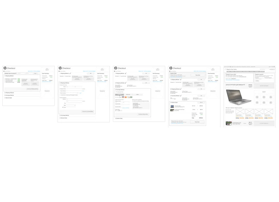
3. Storyboarding & Sequencing
To reduce friction, we began with the checkout. By introducing a guest path, other e-commerce websites had increased their conversion from 38% - 45% (1). To further streamline the process, we recommended a single-page checkout. Multiple A/B tests throughout the industry had found 21% to 169% increase in conversion with this approach (2). Steps were reorganized into a ship, pay and review flow - thereby increasing customer confidence in the online purchase process (3). Tools were also introduced on the cart page to help customers calculate shipping time and costs.
(1) www.getelastic.com/single-vs-two-page-checkout (2) www.onestepcheckout.com/blog/category/cart-abondonment (3) www.nngroup.com/reports/ecommerce
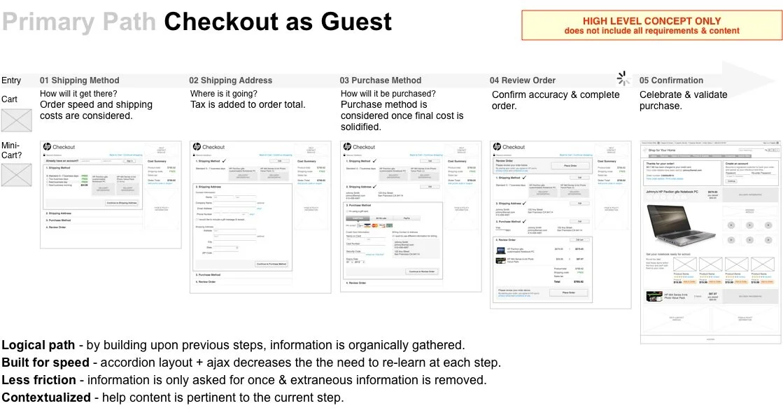
4. Wireframes, Detailed Page & Interaction Flows
This work went hand-in-hand with wireframe creation. First we created wireframes with content and features depicted as grey boxes for each template. However, once we stress tested our flows against research and experience principles we quickly increased the fidelity of the wireframes. Since we were dramatically evolving the experience we worked directly with visual design and engineering to develop new patterns. This resulted in an updated design system. In addition we defined use cases, page & interaction flows.
5. Usability Testing
I created high-fidelity, interactive prototypes for moderated usability testing sessions. Working with a user researcher, tasks for each flow were defined to help answer questions and nail down the most effective design. Content prioritization and new interaction patterns were key areas of focus. Some problems required multiple iterations of tests and design refinement before we reached the final solution.

6. Information Architecture & Card Sorting
Early research had highlighted areas for improvement in the IA, particularly how accessories were organized. Therefore I created an information architecture diagram which outlined the new approach to content grouping. Then, I collaborated with a research team to implement an online closed-card sort and follow-up survey to validate approach. This included new prioritization of filters for narrowing laptop features.
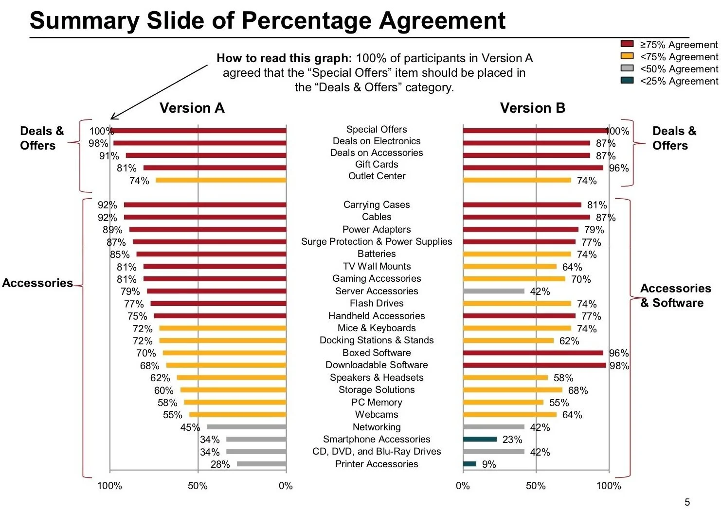
(Completed by the Research Team) Expand image

“Starting with the upfront discovery work she carefully led our team through each step of the process - definition, design, testing, iteration, etc. in a very thorough, efficient, and organized manner.”
Linda Chadwick-Wirth, Experience Architect, Critical Mass


